Angular Material is a UI component library based on material design, the UI standard developed by Google, that provides clean and intuitive components. Components can be easily integrated with angular apps, which helps in achieving elegant and consistent UI. You can also create beautiful dashboards using these components.

Dashboards generally contain charts representing useful data to make analysis easier. In this article, I will guide how to add charts in the material tab component. I will be using CanvasJS angular chart component, which supports 30+ chart types, like line, column, bar, pie, etc. This also makes our life easier using its simple API to customize the look and feel of the chart. It also comes with various features, like zooming, panning, export chart as image, etc. out of the box.
Steps By Steps Instructions
Step 1
Create a simple angular application using angular cli command. If you have already set up the angular application, you can skip this step.
ng new angular-charts-in-material-component
Step 2
Now, navigate to the project directory and install angular material using ng add command. This will also install Component Dev Kit(CDK), Animation Module. To make it simple, I will be using predefined themes and will enable BrowserAnimationModule.
ng add @angular/material
Step 3
Register and import the components in app.module.ts. In this tutorial, I will be using Material Tab Component (MatTabsModule). You can use other material components like dialog, expansion panel, etc. as per your needs.
import { MatTabsModule } from '@angular/material/tabs';
@NgModule({
declarations: [
AppComponent,
],
imports: [..
MatTabsModule.
],
providers: [],
bootstrap: [AppComponent]
})
Step 4
Now, we will add Material Tabs to the template file app.component.html. Add matTabContent directive attribute to each tab body so that content is shown only when it becomes active.
<div [@.disabled]="true">
<mat-tab-group dynamicHeight>
<mat-tab label="Column Chart">
<ng-template matTabContent>
</ng-template>
</mat-tab>
<mat-tab label="Pie Chart">
<ng-template matTabContent>
</ng-template>
</mat-tab>
<mat-tab label="Line Chart">
<ng-template matTabContent>
</ng-template>
</mat-tab>
</mat-tab-group>
</div>
Step 5
After adding tabs to the application, we will now add charts to individual tabs. Before doing that, we will need to install CanvasJS angular chart component and register it. Please refer to this tutorial for basic setup of chart components. After installing the chart components, we will define chart options for different charts to be shown inside individual tabs in our app.component.ts.
export class AppComponent {
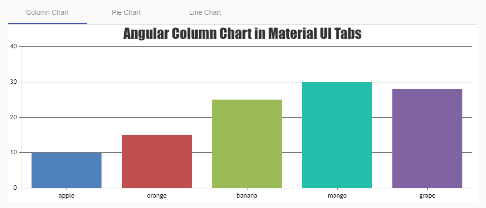
columnChartOptions = {
animationEnabled: true,
title: {
text: 'Angular Column Chart in Material UI Tabs',
},
data: [
{
// Change type to "doughnut", "line", "splineArea", etc.
type: 'column',
dataPoints: [
{ label: 'apple', y: 10 },
{ label: 'orange', y: 15 },
{ label: 'banana', y: 25 },
{ label: 'mango', y: 30 },
{ label: 'grape', y: 28 },
],
},
],
};
pieChartOptions = {
animationEnabled: true,
title: {
text: 'Angular Pie Chart in Material UI Tabs',
},
theme: 'light2', // "light1", "dark1", "dark2"
data: [
{
type: 'pie',
dataPoints: [
{ label: 'apple', y: 10 },
{ label: 'orange', y: 15 },
{ label: 'banana', y: 25 },
{ label: 'mango', y: 30 },
{ label: 'grape', y: 28 },
],
},
],
};
lineChartOptions = {
animationEnabled: true,
title: {
text: 'Angular Line Chart in Material UI Tabs',
},
theme: 'light2', // "light1", "dark1", "dark2"
data: [
{
type: 'line',
dataPoints: [
{ label: 'apple', y: 10 },
{ label: 'orange', y: 15 },
{ label: 'banana', y: 25 },
{ label: 'mango', y: 30 },
{ label: 'grape', y: 28 },
],
},
],
};
}
Step 6
After adding the chart component, we will add the canvasjs-chart directive inside individual tab content with respective chart options defined in app.component.ts.
<div [@.disabled]="true">
<mat-tab-group>
<mat-tab label="Column Chart">
<ng-template matTabContent>
<canvasjs-chart
[options]="columnChartOptions"
[styles]="{ width: '100%', height: '360px' }"
></canvasjs-chart>
</ng-template>
</mat-tab>
<mat-tab label="Pie Chart">
<ng-template matTabContent>
<canvasjs-chart
[options]="pieChartOptions"
[styles]="{ width: '100%', height: '360px' }"
></canvasjs-chart>
</ng-template>
</mat-tab>
<mat-tab label="Line Chart">
<ng-template matTabContent>
<canvasjs-chart
[options]="lineChartOptions"
[styles]="{ width: '100%', height: '360px' }"
></canvasjs-chart>
</ng-template>
</mat-tab>
</mat-tab-group>
</div>
Ta-da! We have successfully plotted a chart inside angular material tabs. Please check out this StackBlitz example for the complete working code.
To take this article to the next step, you can alos add charts inside different angular material components, like dialog, expansion panel, cards, etc. and create beautiful dashboards using it.
You can refer to this link if you want to know more about the other components in angular material. Also, check out this link if you are new to CanvasJS angular chart component and want to explore more about its customization and features.